 4 Min Read
As long time supporters of our company know, the first product we launched to market in 2014 was Airbitz — a mobile Bitcoin wallet, focused on the ability to send and receive BTC between peers and merchants, with a built in business directory to facilitate just that. As the market for crypto assets expanded rapidly, with a widening focus on buying, selling, and trading an ever growing expanse of assets, our business model shifted with the times. These changing market conditions motivated the launch of Edge in February of 2018, a separate application from our legacy project, Airbitz. Edge 1.0 launched with support for multiple different crypto networks and robust buying, selling, and trading functionality built natively into the application, providing an interface and user experience in line with what our users were looking for.
In transitioning from Airbitz to Edge, our company was aware of the necessary changes that needed to take place from a design and product perspective to better serve our users. Over the years since transitioning from Airbitz to Edge and continuing to refine Edge itself, to the same tone, we’ve kept the experience of our users and the resulting design of our application front of mind.
Today we’re proud to announce the roll out of Edge 2.0, an extensive upgrade to Edge’s look and feel, with this same user centric approach informing every decision we’ve made from aesthetic sensibility to practical functionality. This fresh rewrite includes timely user interface and overall user experience improvements that our current and future users are sure to appreciate.
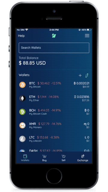
User Interface (UI)
With the goal of making Edge more accessible and user friendly, we redesigned the interface to ensure users’ wallets and data are visually appealing and consistent across the app. In the redesign we moved to dark mode by default and incorporated the Gestalt Principles of simplicity and minimalism into the redesign.
Our previous design was a mash up of dark and light mode, but Edge 2.0 has a consistent dark mode throughout the application.
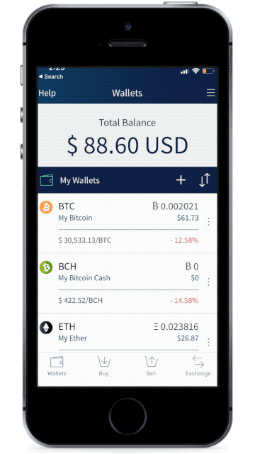
Dark mode creates proper contrasts between texts, shapes, and lines in each scene, improving Edge’s legibility for all and accessibility to those with visual impairments. In addition, dark mode is battery saving and emits less blue light which is directly related to eye strain.
We also modernized the styling of the aesthetic components of the application while simultaneously removing objects and elements in the previous design that aren’t absolutely necessary. And if you look closely, wse introduced softer gradients in the background of the application as well as glow effects to elements and icons which together provide greater visual depth and dimension, giving Edge a more modern feel.
And lastly, we removed many borders, boxes, and lines that previously organized the interface for the user and instead leaned on the “Proximity Principle”: objects that are close together are automatically perceived by users as related to each other or part of a common group. Lines, boxes, and other visual elements explicitly show relationships, but an application with too many of those elements can create a busy, visually unappealing interface. In the redesign we take advantage of what our brains already do automatically by keeping related elements in close proximity. The removal of unnecessary design elements creates lots of white space, or in our case, dark space, that is more visually appealing, creating a cleaner interface for users.
User Experience (UX)
Our first application, Airbitz, was designed to make it as seamless and intuitive as possible for users to both send and receive bitcoin. One of the key features of Airbitz allowed users to swipe immediately to a send or receive screen with no other actions needed. However, our design focus for the transition to Edge 1.0 centered around buying, selling, and trading, causing us to make some sacrifices in regard to sending and receiving crypto-assets. With our latest redesign we’ve re-introduced this older Airbitz feature, enabling Edge users to move to a send or receive screen with just one swipe.
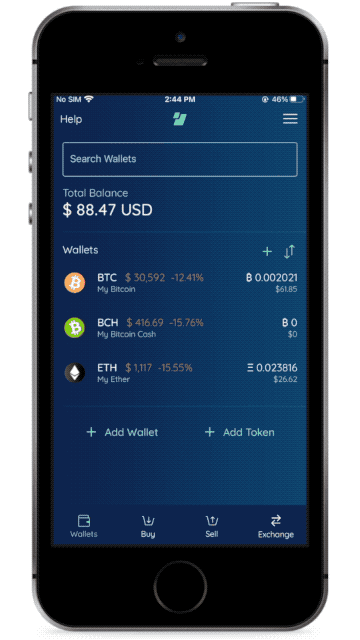
We’ve also added functionality for users to better organize and navigate their wallets and transactions with much greater ease. Previously, wallets could only be sorted manually by dragging and dropping each wallet into the order a user desired. Users can still sort manually In the redesign, but we’ve added the ability to sort wallets alphabetically, by currency code, by currency name, by highest value, and by lowest value, giving users an easy and fast way to organize their wallets according to their preferences.
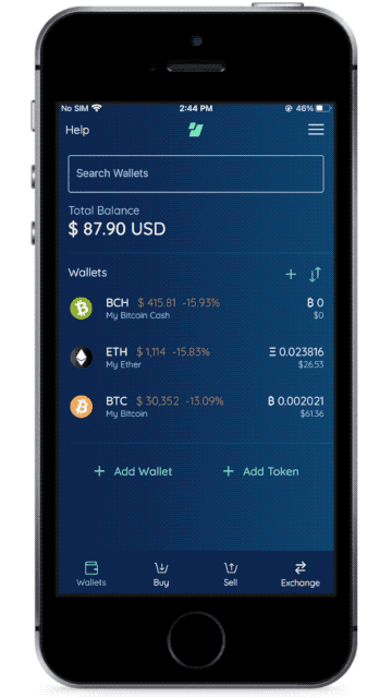
Users will also be able to search for a specific wallet and even specific transactions in their account. Without search functionality, it’s difficult for our power users to find older transactions quickly, but with Edge 2.0 this becomes trivially easy.
Coda
Going forward, Edge will continue making the crypto-asset ecosystem more accessible to anyone with an internet connection and a mobile device. By continually testing and improving our user interface and the ways in which we secure private user data, we hope to provide a user interface that motivates more users to feel safe and empowered using crypto-assets.


