 6 Min Read
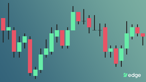
For many people, cryptocurrency was their first introduction to trading and its many tools and vocabulary. Frequently mentioned by many blogs and videos, the typical trading chart is intimidating to the uninitiated, and a lot to handle even for the most seasoned trader. Competent traders must pay attention to and interpret a lot of data quickly, but also filter out less relevant information. Today I’ll break down the most commonly used but frequently misunderstood components of a trading chart. Note that this is not a guide on how to trade or what signals a trading chart could imply but rather a straight forward overview of the information presented.
Candlesticks

At the heart of a trading chart, and for many the most important information displayed, is the candlestick chart. This chart shows price movement over time represented by vertical bars, typically green and red. To people less accustomed to financial trading, a more common line graph would be much more familiar. A line graph simply plots a single vertical value, in our case a price, along a horizontal axis representing time.

Note how a line graph above presents limited information as only a single value can represent an entire day. Very likely the price of an asset during this day was not stable at that single value but certainly had some volatility. The line graph therefore summarizes the individual days by presenting either an average, median, maximum, or minimum price during that time period. All other aspects of the price are lost.

Candlestick charts, invented by Japanese rice traders, on the other hand, can present additional information for a specific time period. The solid red or green bar represents the price when the time period was entered and the final price when the time period was exited. In the case of a green candlestick, the bottom of the green bar is the opening price, while the top is the closing price thereby representing an increase in price during the time period. On the flip side, a red candlestick represents a drop in price, where the top is the opening and the bottom is the closing price.
Candlestick charts get their name from the “wicks” shooting above and below the solid bars. These wicks represent the maximum and minimum price during the time period. In the chart below, the price at precisely 6pm was $11,470. Between 6pm and 7pm the price fluctuated between $11,402 and $11,481. Then at 7pm the price was $11,413.


Candlestick Intervals
Charts are frequently configurable to show information across a time period from the far left to the far right of the chart. Most people are accustomed to configuring the total time covered by the entire chart. For example, if you wanted to see the price movement over a year you would think to configure the chart to a one year interval, which would then arbitrarily break up the year into time periods such as weeks or months. This is how most non-trading charts operate. Trading charts on the other hand usually let you specify only the time period of a single candlestick. Therefore, a “15 minute chart” is not a chart that shows 15 minutes worth of price movement but rather a chart where each candlestick represents 15 minutes of time, such as the chart above. The total time covered by the entire chart is mostly a factor of your screen size, hence why professional traders and degenerate crypto gamblers (is there a difference?) are frequently seen working in front of large multi monitor setups.

Volume Charts
Volume charts are often included beneath a candlestick chart and represent how many units of an asset were exchanged during each time period of a candlestick. Identical to the candlesticks, red volume bars indicate a drop in price, while green bars indicate an increase. There is frequently a high correlation between the amount of volume and the magnitude of price swings. Taller candlesticks are usually accompanied by taller volume bars, as can be seen on the chart below.

Order Book
Typically a trading chart will represent price movement on a specific order matching exchange. Specific to each exchange is the “order book”, which are the various buy and sell orders placed by traders at various prices.

At the center of the order book is the last traded price of an asset, $10,934 in the image above. The red numbers above this price represent the various prices that other traders are asking to sell, while the green numbers below represent the prices traders are bidding to buy. The middle column of white numbers show the quantity of an asset to be sold or bought at the corresponding price. In the chart above, there are a total of 4.96 BTC looking to be sold at the price of $10,942. The far right column of numbers represents the total amount of an asset looking to be bought or sold anywhere between the current price and the order book price. For example in the chart above, a total of 21.17 BTC is for sale between the prices $10,935 and $10,942. This is frequently referred to as the “depth” of an order book and shows how much price movement is likely to occur from buying or selling a given amount of the asset.
Linear vs Logarithmic

Linear charts, like the one pictured above, represent value differences using equidistant vertical spacing. Notice how each vertical space represents exactly $5000 worth of price difference. In a linear chart, the viewer is able to see value changes over time, showing an overall representation of the price directly relative to its highest price value. Looking at this kind of chart allows you to only see volatility in relation to its highest and lowest values, and not the percentage changes. Minor changes on a linear chart appear to be insubstantial when being visually compared to the vast growth of overall price changes.
When you look at the far left of the linear chart above, you can hardly see exponential variances in value, since the fluctuations do not compare to the amount of currency represented in the vertical spacing. Between 2014 and 2015 the price of Bitcoin lost over 80% of its value, going from $1100 to $160. In the chart above that change is barely visible since a $1000 price change is small relative to the $20,000 peak price on the chart.
The logarithmic chart below represents the same asset and time period as the linear chart above. Notice how it helps properly visualize large percentage changes of an asset regardless of the asset price at the time of the change. A 10x increase in price from $10 to $100 is equally represented as a 10x increase from $1000 to $10,000. Looking at the chart below, notice how a ~75% drop in price from $1100 to $260 is represented by the same vertical height as the ~75% drop in price from $19k to $4k. These charts highlight percentage changes regardless of the actual change in value. This is useful in analyzing assets like Bitcoin, which experience large bursts of exponential spikes and crashes over a large period of time.

Coda
While initially intimidating, candlestick charts offer tremendously useful information to both the professional trader and retail investor. With all its switches and knobs it helps paint the history of an asset in various contexts. Whether looking to day trade the micro price changes or simply look for a good entry point for a long term investment, it is a valuable tool at your disposal.


